Based on an original idea by Castagna & Ravelli. Music by Michele Tadini assisted by David Goubes. Chromatophore designed by Gilles Le Blevennec (CEA Liten) and Angelo Guiga (CEA Leti).
An Atelier Arts Sciences production.
This sound and visual installation is in two parts, by three Italian artists and assembles light and music in a continuous motion joining past and present. It was showcased during the Rencontres-i, Arts-Sciences Biennale 2011 at the Bastille - Grenoble. CEA researchers, Gilles Le Blevennec (CEA Liten) and Angelo Guiga (CEA Leti) have orchestrated their work with artists on designing the Chromatophore.
From Obscurity to Light: Moving Towards the Origins of Energy
The Degrees of Light multimedia installation, showcased in two different rooms, is inspired by Romanticism themes of impenetrability, invisibility, contemplation on creation and on absolute space: 2,700 degrees Kelvin and Chromatophore The artwork was created ‘in situ’. It stems from scientific thinking of perception and from philosophical reminiscing about the symbolism of light, the icon of life and godliness. The installation is designed as an initiatory process, with the aim to purify one's visual mind. The spectator is slowly guided from the entrance towards the exit, from obscurity to light, from the shadows to the aura of a blank space until a primary source of energy appears.
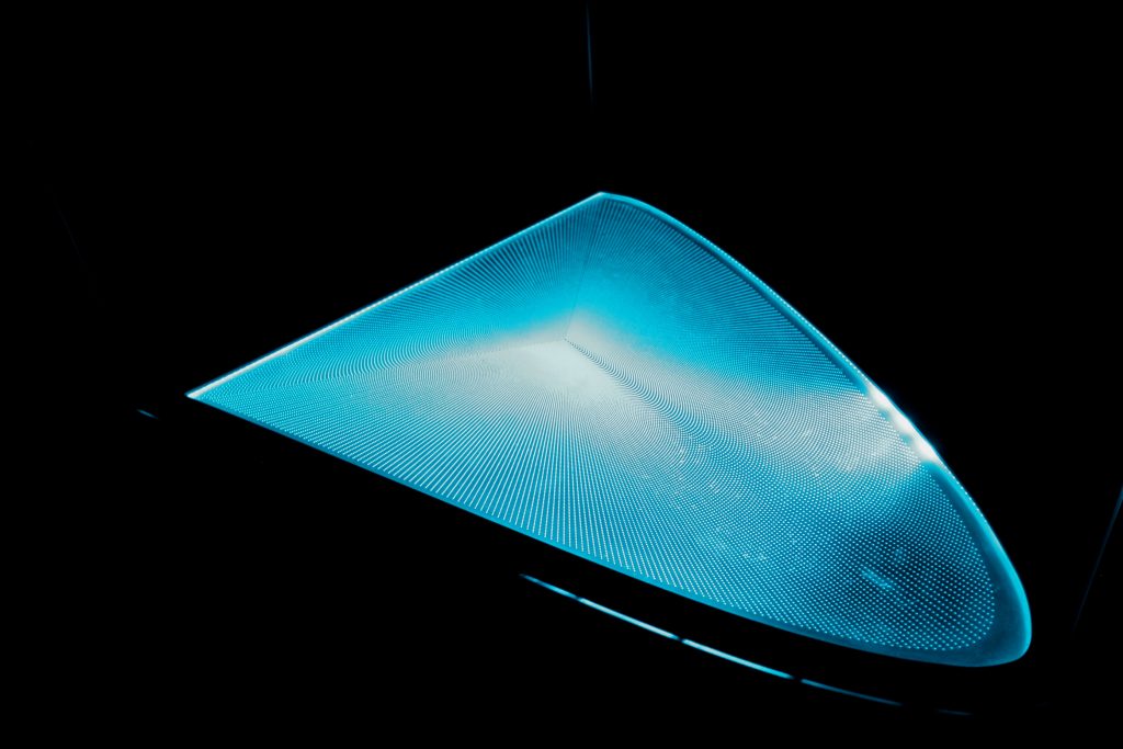
The Chromatophore
With a renewed view, the spectator, still enveloped in obscurity, proceeds to the second room, where in the centre is located the Chromatophore; a luminous body made of LEDs able to combine primary colours to produce different shades and tones. This apparatus, derived from the collaboration of physicists and engineers of Minatec in Grenoble, owes its curved shape to the chromaticity diagram found in mathematical theory. This sort of 'philosophical stone', radiating changing colours, contains the mystery of the primary source of energy and materializes the auroral whiteness which is the sum of the solar spectral colours. This 'non-colour' is by virtue, in visual arts, the symbol of absolute space. Colours influence us in perceiving the world and have a subjective impact on our psyche. Chromatherapy, when applied to psychosomatic disorders, has proven this. But in this case, the sum of the colours introduces a combination that produces a Supreme White, a metaphor for absolute space, of innocence, of purity and of truth. Hope takes shape in this 'cave' and the music gives rhythm to the movement of light. Spectators are plunged into the centre of the resonating body, music gathers and amplifies the movements of light. It amplifies the residual energy reverberating it into space: The harmonic structure of Wagner's Prelude is used as a subterranean resonator, while creating a new sound through the interaction between different musical sources and finally seizing the ancestral harmonies of a New World.
Jacqueline Ceresoli, journalist
Cromatic Scale
The human eye is capable of discerning more than 350,000 colours. Therefore, colours need to be classified so as they can be used in a simple and unambiguous way. In 1931, the International Commission on Illumination (CIE) demonstrated that any colour can be represented in a three-dimensional space: in red, green and blue (RGB). Since it is more convenient to work with a diagram than with a three-dimensional space, an agreement was made to represent a certain colour projected to a diagram. R=1, G=1, B =1.
DEGRÉS DE LUMIÈRE - "Double vibration lumineuse et sonore" by Christiane Dampne, journaliste
LE CHROMATOPHORE - by Gilles Le Blevennec, CEA Liten
Every point on this diagram can be defined by two colorimetric co-ordinates, blue and red for instance. All existing colours have a co-ordinate within this triangle. This simple representation was problematic, namely that certain colours, according to one of the axis of reference, had negative co-ordinates. To avoid having negative colorimetric values, the RGB space was transformed into a linear space. The chromaticity diagram is the result of this transformation. The outline of this diagram represents pure colours from violet to red, spectrum locus, or spectral space. The line joining the red and blue extremities of the visible spectrum is called the line of purple.
Based on an original idea by Castagna & Ravelli.
Music by Michele Tadini assisted by David Goubes.
Chromatophore designed by Gilles Le Blevennec (CEA Liten) and Angelo Guiga (CEA Leti).
Production by Atelier Arts-Sciences